For detailed theoretical foundations, mathematical proofs, and algorithm derivations, see Chapter 12: Real-Time Stream Processing and IoT Pipelines in the PDF textbook.
The PDF chapter includes: - Complete streaming system theory and queueing models - Detailed analysis of windowing strategies (tumbling, sliding, session) - In-depth coverage of backpressure and flow control mechanisms - Mathematical foundations of real-time systems and latency bounds - Comprehensive buffer management and memory trade-off analysis
Explain the difference between batch and stream processing for IoT data
Implement sliding-window aggregation and basic anomaly detection on live streams
Handle producer–consumer rate mismatches using bounded buffers and backpressure
Build a local real-time dashboard for sensor streams
Extend the pipeline to a Raspberry Pi “edge node” and optionally to a cloud/self-hosted visualization service
Theory Summary
Stream processing represents a fundamental shift from batch processing: instead of collecting all data before analysis (batch), stream processing analyzes data as it arrives—essential for real-time IoT applications where waiting isn’t an option. Traditional batch systems accumulate hours of sensor data in databases, then run analytics overnight. Streaming systems process each sample within milliseconds, enabling immediate response to anomalies, continuous monitoring dashboards, and memory-bounded operation on constrained edge devices.
The three-tier architecture connects physical sensors (Arduino reading analog values), edge coordination (Raspberry Pi or laptop running Python/Node.js for parsing, windowing, and aggregation), and cloud visualization (Plotly, InfluxDB+Grafana). Serial communication at 9600 baud transfers ~960 bytes/second, limiting raw throughput—hence the importance of edge aggregation before cloud transmission. A key pattern: Arduino sends “450” (ADC value + newline) at 1 Hz; the edge processor maintains a deque(maxlen=N) ring buffer that automatically discards oldest samples when full, preventing unbounded memory growth.
Sliding windows enable computing statistics over recent history without storing all data. A window of size 50 samples at 10 Hz represents 5 seconds of history. With stride 10 (advance by 10 samples between windows), you get 50% overlap and emit aggregates at 1 Hz—reducing cloud bandwidth 10x while preserving temporal resolution. Backpressure handling addresses rate mismatches: if sensors produce 100 samples/sec but cloud accepts only 10/sec, your buffer fills and must drop data. Three strategies exist—drop oldest (good for real-time, stale data has less value), drop newest (preserves history), or block producer (usually impossible with sensors). Production systems monitor buffer utilization: consistently >80% means the consumer is too slow.
Anomaly detection via z-scores compares each sample to recent statistics: z = |x - μ| / σ. Values with |z| > 2 are unusual (95% confidence), |z| > 3 very unusual (99.7%). For time-windowed aggregation, collect samples for fixed duration (e.g., 5 seconds), compute min/max/mean/std, emit as single JSON record—achieving 20:1 data reduction before cloud transmission. Cloud services like Plotly impose rate limits (~50 points/sec), making local aggregation mandatory for high-frequency sensors.
Key Concepts at a Glance
Batch vs Stream: Batch collects all data then processes (minutes-hours latency); Stream processes each sample as it arrives (milliseconds latency)
Ring Buffers: deque(maxlen=N) in Python automatically drops oldest when full; prevents unbounded memory growth in infinite streams
Sliding Windows: Size (how many samples), Stride (advancement between windows), Overlap = (size - stride) / size; 50% overlap typical
Backpressure: When producer outpaces consumer, bounded buffers drop data; monitor utilization >80% = trouble, drop_rate >1% = capacity issue
Serial Communication: Arduino Serial.println(value) → 9600 baud → Python readline().decode() → int(line); baud rate must match both sides
Windowed Aggregation: Time-based (5 sec windows emit stats) or count-based (50 samples → aggregate); reduces bandwidth N:1
Anomaly Detection: Z-score method: z = |sample - mean| / std over rolling window; threshold |z| > 2 (unusual), |z| > 3 (very unusual)
Cloud Rate Limits: Plotly ~50 points/sec, must aggregate locally; InfluxDB handles higher rates but storage costs scale
Common Pitfalls
Ignoring backpressure until production: System works perfectly in testing at 1 sample/sec, crashes in production at 100 samples/sec. Memory grows unbounded until process is killed. Always use deque(maxlen=N) bounded buffers and monitor utilization.
Baud rate mismatch: Arduino sends at 115200 but Python reads at 9600—you receive garbled data or only every 12th byte. Both sides must agree. Check Arduino Serial.begin(9600) matches Python serial.Serial(port, 9600).
Blocking network calls in data path: Calling http.post() or plotly.stream.write() blocks until response—if cloud is slow or offline, your entire pipeline stalls and sensor buffer overflows. Use async patterns or separate threads for I/O.
Window size too small: Windows of 5-10 samples produce noisy statistics (std fluctuates wildly). Use at least 20-50 samples for stable mean/std, more for skewed distributions. Balance smoothness against latency budget.
Not testing network failure: System works when WiFi is perfect, crashes when cloud service is down. Implement local buffering with disk persistence, offline plotting fallbacks, and graceful reconnection with exponential backoff.
Test your understanding before proceeding to the exercises.
Question 1: Calculate the window overlap percentage for a sliding window with size=100 samples and stride=25 samples.
Answer: Overlap = ((Window Size - Stride) / Window Size) × 100% = ((100 - 25) / 100) × 100% = 75%. This means 75% of each window overlaps with the previous window, providing high temporal continuity. With stride=25, you advance by only 25 samples between windows, so 75 samples are repeated from the previous window. Benefits: smoother transitions, less likely to miss events at window boundaries. Cost: 4× more computation (processing each sample 4 times on average). Lower overlap (50% with stride=50) balances continuity and efficiency.
Question 2: Your Arduino sends sensor readings at 100 Hz over 9600 baud serial. Will this work reliably?
Answer: Probably not. At 9600 baud = 9600 bits/sec ≈ 960 bytes/sec (10 bits per byte with start/stop bits). If each reading is “1023” (5 bytes), you can send 960 / 5 = 192 readings/sec maximum. For 100 Hz (100 readings/sec), you need 500 bytes/sec, which theoretically fits. However, real overhead (framing, timing jitter, processing delays) often pushes actual throughput to 60-70% of theoretical. Better: increase baud rate to 115200 for 10× more bandwidth (11,520 bytes/sec), providing comfortable headroom. Or reduce data rate by sending aggregated statistics (mean of 10 samples) at 10 Hz instead of raw values at 100 Hz.
Question 3: Your bounded buffer (capacity=100) has 95 samples and you’re receiving 10 samples/sec while processing 8 samples/sec. What happens?
Answer:Buffer overflow imminent. Current utilization = 95/100 = 95% (danger zone). Net accumulation rate = 10 - 8 = +2 samples/sec. Time to overflow = (100 - 95) / 2 = 2.5 seconds. Once full, the bounded buffer drops data. With a ring buffer (deque with maxlen), it drops the oldest samples. This causes: data loss, missed events, and discontinuities in analysis. Solutions: (1) Increase processing rate - optimize consumer to handle 10+ samples/sec, (2) Reduce production rate - sample at 8 Hz instead of 10 Hz, (3) Increase buffer size to handle temporary bursts, (4) Add backpressure - signal producer to slow down when buffer >80% full. Monitor utilization continuously; >80% = warning, >95% = critical.
Question 4: Calculate the z-score for a sensor reading of 580 when the rolling window has mean=500 and std=40. Is this an anomaly (threshold=2.5)?
Answer: z = |x - μ| / σ = |580 - 500| / 40 = 80 / 40 = 2.0. Since z = 2.0 < 2.5 (threshold), this is NOT classified as an anomaly. The reading is 2 standard deviations above the mean, which represents the 95th percentile (5% of normal readings exceed this). With threshold=2.5, you’d flag readings >3σ (99.7th percentile), catching only extreme outliers. Trade-off: lower threshold (e.g., 2.0) detects more anomalies but increases false positives (5% false alarm rate); higher threshold (e.g., 3.0) reduces false positives (0.3% false alarm rate) but might miss subtle anomalies. Tune threshold based on application: critical safety systems use lower thresholds despite false positives.
Question 5: Why must you use async patterns or separate threads for cloud uploads in streaming systems?
Answer: Blocking I/O in the data processing path causes catastrophic failures. If you call http.post(data) synchronously in your sensor reading loop, the entire system freezes until the server responds (10-1000ms typical, infinite if network fails). During this time: (1) Sensor buffer overflows as new samples arrive but aren’t processed, (2) Real-time deadlines are missed, (3) System becomes completely unresponsive. Example: sensors produce 100 samples/sec, cloud POST takes 200ms → you miss 20 samples per upload. Solution: Use async/await (Python asyncio, JavaScript promises) or producer-consumer threads (sensor thread fills buffer, upload thread drains buffer at its own pace). The upload rate doesn’t affect sensor rate. If network fails, buffer fills and old data drops, but sensor keeps running. Never block your critical data path with I/O!
Try It Yourself
These interactive Python examples demonstrate stream processing concepts. Run them to understand windowing, buffering, and anomaly detection before implementing real sensor pipelines.
Little’s Law Demonstration
Understand the relationship between arrival rate, service rate, and queue length:
Code
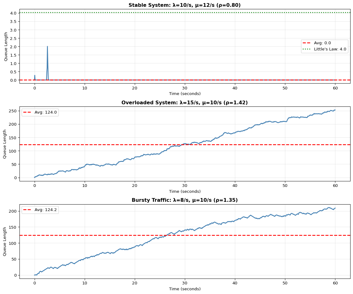
import numpy as npimport matplotlib.pyplot as pltfrom collections import dequeimport timedef littles_law_demo():""" Demonstrate Little's Law: L = λ × W where L = avg items in system λ = arrival rate W = avg time in system """print("="*70)print("Little's Law: L = λ × W")print("="*70) scenarios = [ {'name': 'Stable System','arrival_rate': 10, # samples/sec'service_rate': 12, # samples/sec'duration': 60 }, {'name': 'Overloaded System','arrival_rate': 15, # samples/sec'service_rate': 10, # samples/sec (slower than arrival!)'duration': 60 }, {'name': 'Bursty Traffic','arrival_rate': 8, # average'service_rate': 10,'duration': 60,'bursty': True } ] fig, axes = plt.subplots(len(scenarios), 1, figsize=(12, 10))for idx, scenario inenumerate(scenarios): ax = axes[idx]# Simulate arrivals and processing np.random.seed(42+ idx) duration = scenario['duration'] arrival_rate = scenario['arrival_rate'] service_rate = scenario['service_rate']# Generate arrival timesif scenario.get('bursty', False):# Bursty: cluster arrivals arrival_times = [] t =0while t < duration:# Burst or quiet periodif np.random.random() <0.3: # 30% chance of burst burst_size = np.random.randint(3, 8)for _ inrange(burst_size): arrival_times.append(t) t +=0.05# Rapid arrivalselse: t += np.random.exponential(1/ arrival_rate)if t < duration: arrival_times.append(t)else:# Poisson arrivals inter_arrival_times = np.random.exponential(1/ arrival_rate, int(duration * arrival_rate *2)) arrival_times = np.cumsum(inter_arrival_times) arrival_times = arrival_times[arrival_times < duration]# Simulate queue queue_length = [] timestamps = [] current_queue =0 last_service_time =0for t in np.linspace(0, duration, 1000):# Add arrivals up to time t arrivals_so_far = np.sum(np.array(arrival_times) <= t)# Process items based on service rate items_processed =min(service_rate * t, arrivals_so_far)# Queue length = arrivals - processed current_queue = arrivals_so_far - items_processed queue_length.append(current_queue) timestamps.append(t)# Calculate statistics avg_queue_length = np.mean(queue_length) max_queue_length = np.max(queue_length) actual_arrival_rate =len(arrival_times) / duration# Little's Law prediction utilization = actual_arrival_rate / service_rateif utilization <1: avg_wait_time =1/ (service_rate - actual_arrival_rate) predicted_queue = actual_arrival_rate * avg_wait_timeelse: predicted_queue =float('inf')# Plot ax.plot(timestamps, queue_length, linewidth=2, color='steelblue') ax.axhline(y=avg_queue_length, color='red', linestyle='--', label=f'Avg: {avg_queue_length:.1f}', linewidth=2)if utilization <1: ax.axhline(y=predicted_queue, color='green', linestyle=':', label=f"Little's Law: {predicted_queue:.1f}", linewidth=2) ax.set_title(f"{scenario['name']}: λ={arrival_rate}/s, μ={service_rate}/s "f"(ρ={utilization:.2f})", fontweight='bold') ax.set_xlabel('Time (seconds)') ax.set_ylabel('Queue Length') ax.legend() ax.grid(True, alpha=0.3)# Print statisticsprint(f"\n{scenario['name']}:")print(f" Arrival rate (λ): {actual_arrival_rate:.2f} items/sec")print(f" Service rate (μ): {service_rate:.2f} items/sec")print(f" Utilization (ρ): {utilization:.2f}")print(f" Avg queue length: {avg_queue_length:.2f}")print(f" Max queue length: {max_queue_length:.0f}")if utilization <1:print(f" Little's Law pred: {predicted_queue:.2f}")else:print(f" Status: UNSTABLE - Queue grows unbounded!") plt.tight_layout() plt.show()littles_law_demo()print("\n"+"="*70)print("Key Takeaways:")print("="*70)print("1. When λ < μ (arrival < service), queue remains bounded")print("2. When λ > μ, queue grows unbounded → system failure")print("3. Bursty traffic causes temporary queue spikes even when λ < μ")print("4. Always size buffers for peak load, not average load!")
======================================================================
Little's Law: L = λ × W
======================================================================

Stable System:
  Arrival rate (λ):    9.62 items/sec
  Service rate (μ):    12.00 items/sec
  Utilization (ρ):     0.80
  Avg queue length:    0.01
  Max queue length:    2
  Little's Law pred:   4.03

Overloaded System:
  Arrival rate (λ):    14.22 items/sec
  Service rate (μ):    10.00 items/sec
  Utilization (ρ):     1.42
  Avg queue length:    123.99
  Max queue length:    253
  Status: UNSTABLE - Queue grows unbounded!

Bursty Traffic:
  Arrival rate (λ):    13.50 items/sec
  Service rate (μ):    10.00 items/sec
  Utilization (ρ):     1.35
  Avg queue length:    124.17
  Max queue length:    211
  Status: UNSTABLE - Queue grows unbounded!

======================================================================
Key Takeaways:
======================================================================
1. When λ < μ (arrival < service), queue remains bounded
2. When λ > μ, queue grows unbounded → system failure
3. Bursty traffic causes temporary queue spikes even when λ < μ
4. Always size buffers for peak load, not average load!
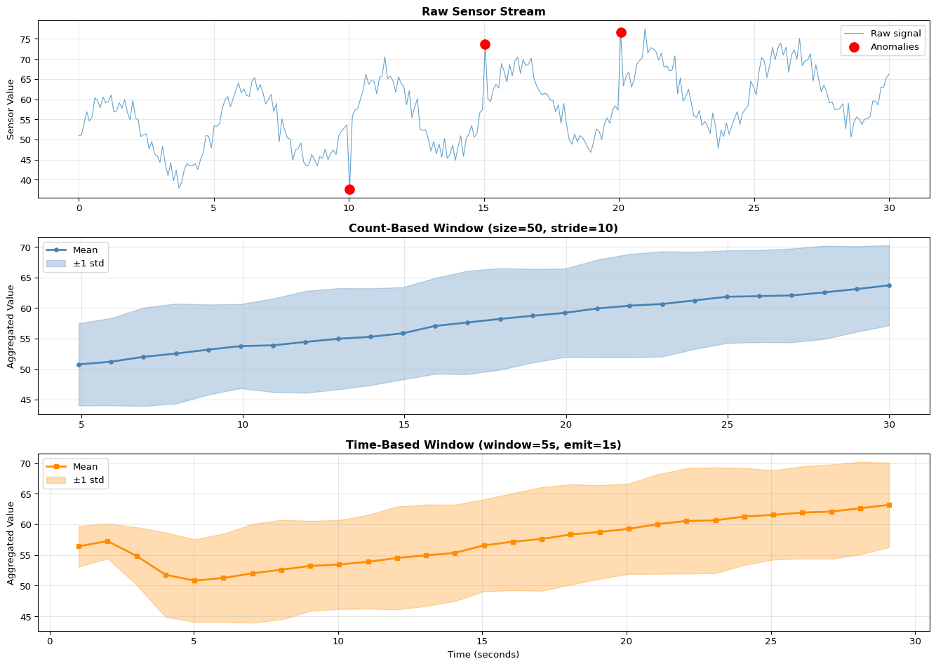
Sliding Window Implementation
Implement count-based and time-based sliding windows:
Code
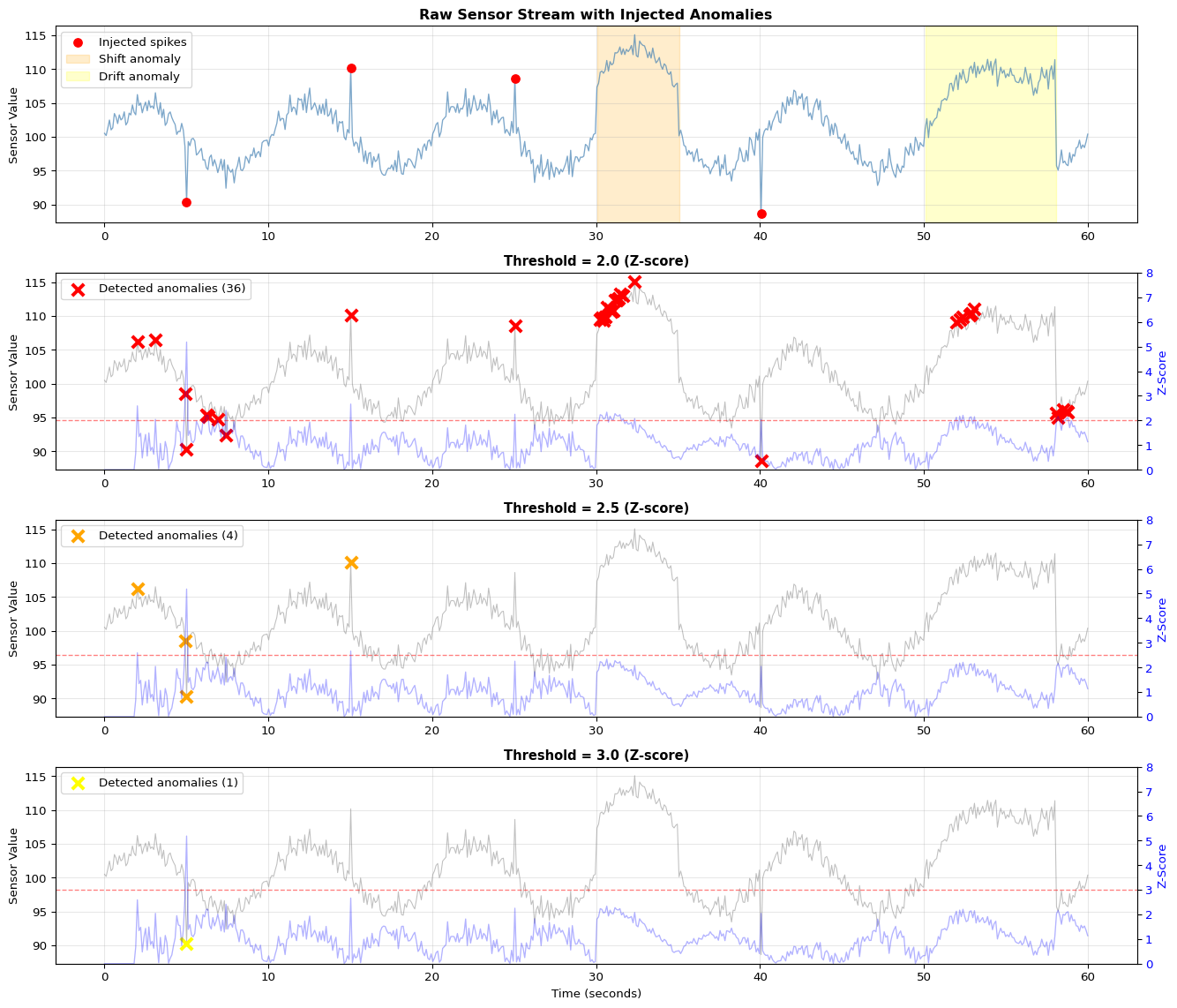
import numpy as npimport matplotlib.pyplot as pltfrom collections import dequeimport timeclass SlidingWindowCounter:"""Count-based sliding window"""def__init__(self, window_size, stride):self.window_size = window_sizeself.stride = strideself.buffer= deque(maxlen=window_size)self.samples_since_emit =0def add(self, sample):"""Add sample and return aggregated window if stride reached"""self.buffer.append(sample)self.samples_since_emit +=1iflen(self.buffer) ==self.window_size andself.samples_since_emit >=self.stride:self.samples_since_emit =0# Return window statistics window_array = np.array(self.buffer)return {'mean': np.mean(window_array),'std': np.std(window_array),'min': np.min(window_array),'max': np.max(window_array),'count': len(window_array) }returnNoneclass SlidingWindowTime:"""Time-based sliding window"""def__init__(self, window_seconds, emit_interval_seconds):self.window_seconds = window_secondsself.emit_interval = emit_interval_secondsself.buffer= deque()self.last_emit_time =Nonedef add(self, sample, timestamp):"""Add sample with timestamp"""self.buffer.append((timestamp, sample))# Remove samples outside window cutoff_time = timestamp -self.window_secondswhileself.bufferandself.buffer[0][0] < cutoff_time:self.buffer.popleft()# Check if time to emitifself.last_emit_time isNone:self.last_emit_time = timestampif timestamp -self.last_emit_time >=self.emit_interval:self.last_emit_time = timestamp# Compute statistics on current window values = [v for _, v inself.buffer]if values:return {'mean': np.mean(values),'std': np.std(values),'min': np.min(values),'max': np.max(values),'count': len(values),'window_seconds': self.window_seconds }returnNone# Demonstrate sliding windowsprint("="*70)print("Sliding Window Comparison")print("="*70)# Generate synthetic sensor streamnp.random.seed(42)duration =30# secondssample_rate =10# Hznum_samples = duration * sample_ratetimestamps = np.linspace(0, duration, num_samples)# Create signal with trend and noisesignal =50+0.5* timestamps +10* np.sin(2* np.pi *0.2* timestamps) +\ np.random.normal(0, 2, num_samples)# Add some anomaliesanomaly_indices = [100, 150, 200]for idx in anomaly_indices:if idx <len(signal): signal[idx] += np.random.choice([-15, 15])# Count-based windowwindow_count = SlidingWindowCounter(window_size=50, stride=10)count_results = []count_times = []for t, val inzip(timestamps, signal): result = window_count.add(val)if result: count_results.append(result) count_times.append(t)# Time-based windowwindow_time = SlidingWindowTime(window_seconds=5.0, emit_interval_seconds=1.0)time_results = []time_times = []for t, val inzip(timestamps, signal): result = window_time.add(val, t)if result: time_results.append(result) time_times.append(t)# Visualizefig, axes = plt.subplots(3, 1, figsize=(14, 10))# Raw signalaxes[0].plot(timestamps, signal, linewidth=0.8, alpha=0.7, label='Raw signal')axes[0].scatter([timestamps[i] for i in anomaly_indices if i <len(timestamps)], [signal[i] for i in anomaly_indices if i <len(signal)], color='red', s=100, zorder=5, label='Anomalies')axes[0].set_title('Raw Sensor Stream', fontweight='bold', fontsize=12)axes[0].set_ylabel('Sensor Value')axes[0].legend()axes[0].grid(True, alpha=0.3)# Count-based windowingif count_results: means = [r['mean'] for r in count_results] stds = [r['std'] for r in count_results] axes[1].plot(count_times, means, linewidth=2, marker='o', markersize=4, label='Mean', color='steelblue') axes[1].fill_between(count_times, np.array(means) - np.array(stds), np.array(means) + np.array(stds), alpha=0.3, color='steelblue', label='±1 std') axes[1].set_title('Count-Based Window (size=50, stride=10)', fontweight='bold', fontsize=12) axes[1].set_ylabel('Aggregated Value') axes[1].legend() axes[1].grid(True, alpha=0.3)print(f"\nCount-Based Window:")print(f" Window size: 50 samples (5 seconds at 10 Hz)")print(f" Stride: 10 samples")print(f" Overlap: {(50-10)/50*100:.0f}%")print(f" Output rate: {len(count_results) / duration:.1f} results/sec")print(f" Data reduction: {len(signal) /len(count_results):.1f}x")# Time-based windowingif time_results: means = [r['mean'] for r in time_results] stds = [r['std'] for r in time_results] axes[2].plot(time_times, means, linewidth=2, marker='s', markersize=4, label='Mean', color='darkorange') axes[2].fill_between(time_times, np.array(means) - np.array(stds), np.array(means) + np.array(stds), alpha=0.3, color='darkorange', label='±1 std') axes[2].set_title('Time-Based Window (window=5s, emit=1s)', fontweight='bold', fontsize=12) axes[2].set_xlabel('Time (seconds)') axes[2].set_ylabel('Aggregated Value') axes[2].legend() axes[2].grid(True, alpha=0.3)print(f"\nTime-Based Window:")print(f" Window duration: 5 seconds")print(f" Emit interval: 1 second")print(f" Output rate: {len(time_results) / duration:.1f} results/sec")print(f" Avg samples/window: {np.mean([r['count'] for r in time_results]):.1f}")print(f" Data reduction: {len(signal) /len(time_results):.1f}x")plt.tight_layout()plt.show()
Option A: Tumbling Window (Current approach) - Pros: Simple, no overlap, low memory, each sample processed once - Cons: May miss events at window boundaries - Use case: Aggregation for cloud transmission (every 1 minute)
Option B: Sliding Window - Pros: Smooth updates, catches all events, better anomaly detection - Cons: 10× more computations for 90% overlap, higher CPU - Code modification: Move window by 1 sample instead of full window size
Option C: Session Window - Pros: Groups related activity (user sessions), variable duration - Cons: Requires gap detection logic, unbounded size - Use case: User interaction analysis (web analytics, IoT device usage)
Option D: Hopping Window - Pros: Balance between tumbling and sliding (e.g., 50% overlap) - Cons: Still processes samples multiple times - Code: Advance window by window_size // hop_factor
When to use each: - Use Option A (tumbling) for data reduction/aggregation - Use Option B (sliding) for real-time anomaly detection - Use Option C (session) for event-driven processing - Use Option D (hopping) when you need some overlap but not full sliding
🔬 Try It Yourself: Window Parameters
Parameter
Current
Try These
Expected Effect
window_size
20 samples
10, 50, 100
Larger = smoother but more lag
anomaly_threshold
2.5 σ
2.0, 3.0, 4.0
Lower = more sensitive (more false alarms)
Overlap
0% (tumbling)
50%, 90%
Higher = more frequent updates, more CPU
Experiment: Compare window sizes
for win_size in [10, 20, 50]: processor = StreamProcessor(window_size=win_size)# Process stream and measure latency and smoothness
Expected: Larger window = smoother stats but slower to detect changes
Section 6: Backpressure Handling
6.1 What is Backpressure?
Backpressure occurs when a downstream component cannot keep up with the upstream data rate. Without handling, this causes:
Memory exhaustion (unbounded buffer growth)
Increased latency (queue buildup)
Data loss (buffer overflow)
6.2 Backpressure Strategies
Strategy
Description
Pro
Con
Drop
Discard excess data
Simple, bounded memory
Data loss
Sample
Keep every Nth item
Bounded, representative
Loses detail
Buffer
Store temporarily
No loss (if enough space)
Memory, latency
Throttle
Slow producer
No loss
Blocks producer
6.3 Drop Policies
When buffer is full: - Drop Head: Remove oldest (FIFO overflow) - Drop Tail: Reject newest (most common) - Drop Random: Random selection (for sampling)
💡 Alternative Approaches: Backpressure Handling
Option A: Drop Newest (Current approach) - Pros: Simple, protects old data, FIFO semantics - Cons: Loses recent (potentially important) data - Use case: Historical logging where old data is valuable
Option B: Drop Oldest - Pros: Always has most recent data, good for monitoring - Cons: Loses history, may miss long-term patterns - Use case: Real-time dashboards, live monitoring
Option C: Sampling/Decimation - Pros: Keeps representative subset, bounded memory - Cons: Non-uniform sampling, may miss spikes - Code: Keep every Nth sample when buffer is full
Option D: Lossy Compression - Pros: Keeps more data in same space, preserves trends - Cons: Complex, not exact reconstruction - Methods: Delta encoding, run-length encoding, downsampling
Option E: Throttling (Backpressure) - Pros: No data loss, exact semantics - Cons: Blocks producer (may cause upstream issues) - Code: if buffer.full(): wait_until_space()
When to use each: - Use Option A when historical context is critical (logs, audit) - Use Option B for live dashboards and alerts - Use Option C when approximate statistics are acceptable - Use Option D for time-series data with trends - Use Option E only when producer can safely block
🔬 Try It Yourself: Backpressure Strategies
Strategy
Data Loss
Latency
Memory
Best For
Drop Newest
Recent data
Low
Fixed
Logging
Drop Oldest
Old data
Low
Fixed
Monitoring
Sample
Uniform loss
Low
Fixed
Statistics
Throttle
None
High
Fixed
Guarantees
Experiment: Compare under overload
for policy in ['drop_newest', 'drop_oldest', 'sample']: stats, history = simulate_backpressure( producer_rate=200, # 2× faster than consumer! consumer_rate=100, duration_s=10, buffer_size=50, policy=policy )print(f'{policy}: {stats["drop_rate"]:.1f}% loss')
Section 7: Time-Windowed Aggregation
7.1 Reducing Data Volume
For cloud transmission, we aggregate data into time windows:
If queue keeps growing (backpressure): - Check: Is consumer slower than producer? → Measure rates with timestamps - Check: Is processing blocking? → Move heavy computation to separate thread - Check: Is there a memory leak? → Monitor buffer size over time - Solution: Increase consumer speed, add more consumers (parallelism), or apply backpressure - Formula: For stability, need μ > λ (service rate > arrival rate)
If seeing high latency (messages delayed): - Check: Is queue too long? → Indicates consumer can’t keep up - Check: Is network adding delay? → Use ping to measure baseline latency - Check: Are you using QoS 2? → Downgrade to QoS 1 for faster transmission - Diagnostic: Log timestamps at each stage (ingest, process, sink) to find bottleneck - Target: End-to-end latency should be < 100ms for real-time applications
If anomaly detection has false positives: - Check: Is window size too small? → Smaller window = noisier statistics - Check: Is threshold too low? → 2.5σ catches ~1% as anomalies, try 3.0σ - Check: Is data non-stationary? → Use adaptive threshold that tracks baseline - Check: Are there outliers in window? → Use median instead of mean for robustness
If data loss/dropped messages: - Check: Is buffer too small? → Increase buffer_size or decrease producer rate - Check: Is consumer crashing? → Add try-catch and logging - Check: Is network unreliable? → Add retry logic with exponential backoff - Diagnostic: Log buffer utilization percentage over time
If Pi/edge device runs out of memory: - Check: Are buffers unbounded? → Set maxlen on deque - Check: Are you holding references? → Clear old data after processing - Check: Is there memory fragmentation? → Restart process periodically - Monitor: Use htop or psutil to track memory usage - Solution: Process in smaller batches, use memory-mapped files for large datasets
If timestamps are out of order: - Check: Is data arriving from multiple sources? → Need to sort or use event time - Check: Are clocks synchronized? → Use NTP for distributed systems - Check: Is there network reordering? → Add sequence numbers - Solution: Buffer and sort by timestamp, or process out-of-order with watermarks
Serial communication issues (Arduino → Pi): - Check: Is baud rate matching? → Both sides must use same rate (9600, 115200) - Check: Is port correct? → On Linux: /dev/ttyACM0 or /dev/ttyUSB0 - Check: Are permissions set? → Add user to dialout group: sudo usermod -a -G dialout $USER - Check: Is Arduino resetting on serial open? → Add 10µF capacitor between RST and GND - Diagnostic: Use screen /dev/ttyACM0 9600 to test raw serial output
Section 8: Serial Communication (Level 2+)
For actual Arduino-to-Pi communication, use pyserial:
# Install: pip install pyserialimport serialimport time# Configure serial portser = serial.Serial('/dev/ttyACM0', 9600, timeout=1)time.sleep(2) # Wait for Arduino resetwhileTrue:if ser.in_waiting >0: line = ser.readline().decode('utf-8').strip()if line:# Parse: "light,temperature" parts = line.split(',') light =int(parts[0]) temp =float(parts[1])print(f"Light: {light}, Temp: {temp}°C")
Environment: local Jupyter or Colab, no hardware required.
Suggested workflow:
Use the notebook to generate synthetic sensor streams and visualise them over time.
Implement sliding windows with different window sizes and strides; plot the effects on smoothing and latency.
Add a bounded buffer (e.g., deque(maxlen=N)) and measure drop rate under different input rates.
Implement a simple anomaly detector (e.g., Z-score) and test it on injected “spikes”.
Record observations: for which window/stride/buffer settings do you meet a given latency budget with acceptable detection quality?
Here you connect a real Arduino sensor stream to a local edge process (on your laptop or Raspberry Pi), but keep everything within your own network.
Suggested steps:
Flash the simple light-sensor sketch from Chapter 12 (or reuse a LAB08 sensor sketch that prints one value per line over Serial).
On your laptop or Raspberry Pi, run the Python or Node.js serial reader from the notebook/code:
Parse serial lines, validate ranges, and push samples into a bounded buffer.
Apply the same windowed statistics and anomaly detection you prototyped in Level 1.
Build a local dashboard:
Either use matplotlib + FuncAnimation (Python) or a small web dashboard (e.g., Plotly/Dash) served from the Pi.
Stress-test the pipeline by:
Increasing sensor sample rate.
Introducing artificial network or processing delays.
Observing buffer utilisation, drop rates, and end-to-end latency.
Outcome: you now have an edge node that consumes real sensor data and exposes a live local dashboard without requiring cloud services.
Now add an external visualization target (cloud or self-hosted) and think about production constraints.
Two main options:
Cloud (e.g., Plotly):
Create a Plotly account and obtain API key/streaming token.
Run the server2.js or equivalent script that forwards aggregated windows from your Pi/laptop to Plotly streams.
Observe rate limits and adjust your windowing/aggregation accordingly (e.g., send 1 point/sec per stream).
Self-hosted (InfluxDB + Grafana on Pi):
Install InfluxDB and Grafana on the Raspberry Pi.
Modify your Level 2 pipeline to write aggregated metrics into InfluxDB.
Build a Grafana dashboard showing recent metrics and anomalies.
In both cases:
Document your full three-layer architecture: Arduino (physical) → Pi/host (coordination + aggregation) → visualization (cloud or self-hosted).
Measure approximate end-to-end latency (sensor change to dashboard update) and discuss whether it meets your application’s needs.
Reflect on backpressure and fault-tolerance: what happens if the visualization service is slow or offline? How does your design avoid unbounded queues?
Related Labs
Data Pipelines
LAB08: Arduino Sensors - Collect sensor data for streaming
LAB09: ESP32 Wireless - Wireless sensor data transmission
LAB13: Distributed Data - Store and query streamed data
Stream Processing Applications
LAB10: EMG Biomedical - Real-time signal processing
LAB14: Anomaly Detection - Anomaly detection on streams
---title: "LAB12: Real-Time Streaming"subtitle: "Stream Processing for IoT"---::: {.callout-note}## PDF Textbook ReferenceFor detailed theoretical foundations, mathematical proofs, and algorithm derivations, see **Chapter 12: Real-Time Stream Processing and IoT Pipelines** in the [PDF textbook](../downloads/Edge-Analytics-Lab-Book-v1.0.0.pdf).The PDF chapter includes:- Complete streaming system theory and queueing models- Detailed analysis of windowing strategies (tumbling, sliding, session)- In-depth coverage of backpressure and flow control mechanisms- Mathematical foundations of real-time systems and latency bounds- Comprehensive buffer management and memory trade-off analysis:::[](https://colab.research.google.com/github/ngcharithperera/edge-analytics-lab-book/blob/main/notebooks/LAB12_streaming.ipynb)[Download Notebook](https://raw.githubusercontent.com/ngcharithperera/edge-analytics-lab-book/main/notebooks/LAB12_streaming.ipynb)## Learning ObjectivesBy the end of this lab you should be able to:- Explain the difference between batch and stream processing for IoT data- Implement sliding-window aggregation and basic anomaly detection on live streams- Handle producer–consumer rate mismatches using bounded buffers and backpressure- Build a local real-time dashboard for sensor streams- Extend the pipeline to a Raspberry Pi "edge node" and optionally to a cloud/self-hosted visualization service## Theory SummaryStream processing represents a fundamental shift from batch processing: instead of collecting all data before analysis (batch), stream processing analyzes data **as it arrives**—essential for real-time IoT applications where waiting isn't an option. Traditional batch systems accumulate hours of sensor data in databases, then run analytics overnight. Streaming systems process each sample within milliseconds, enabling immediate response to anomalies, continuous monitoring dashboards, and memory-bounded operation on constrained edge devices.The **three-tier architecture** connects physical sensors (Arduino reading analog values), edge coordination (Raspberry Pi or laptop running Python/Node.js for parsing, windowing, and aggregation), and cloud visualization (Plotly, InfluxDB+Grafana). Serial communication at 9600 baud transfers ~960 bytes/second, limiting raw throughput—hence the importance of edge aggregation before cloud transmission. A key pattern: Arduino sends "450\n" (ADC value + newline) at 1 Hz; the edge processor maintains a `deque(maxlen=N)` ring buffer that automatically discards oldest samples when full, preventing unbounded memory growth.**Sliding windows** enable computing statistics over recent history without storing all data. A window of size 50 samples at 10 Hz represents 5 seconds of history. With stride 10 (advance by 10 samples between windows), you get 50% overlap and emit aggregates at 1 Hz—reducing cloud bandwidth 10x while preserving temporal resolution. **Backpressure handling** addresses rate mismatches: if sensors produce 100 samples/sec but cloud accepts only 10/sec, your buffer fills and must drop data. Three strategies exist—drop oldest (good for real-time, stale data has less value), drop newest (preserves history), or block producer (usually impossible with sensors). Production systems monitor buffer utilization: consistently >80% means the consumer is too slow.**Anomaly detection** via z-scores compares each sample to recent statistics: z = |x - μ| / σ. Values with |z| > 2 are unusual (95% confidence), |z| > 3 very unusual (99.7%). For time-windowed aggregation, collect samples for fixed duration (e.g., 5 seconds), compute min/max/mean/std, emit as single JSON record—achieving 20:1 data reduction before cloud transmission. Cloud services like Plotly impose rate limits (~50 points/sec), making local aggregation mandatory for high-frequency sensors.::: {.callout-tip}## Key Concepts at a Glance- **Batch vs Stream**: Batch collects all data then processes (minutes-hours latency); Stream processes each sample as it arrives (milliseconds latency)- **Ring Buffers**: `deque(maxlen=N)` in Python automatically drops oldest when full; prevents unbounded memory growth in infinite streams- **Sliding Windows**: Size (how many samples), Stride (advancement between windows), Overlap = (size - stride) / size; 50% overlap typical- **Backpressure**: When producer outpaces consumer, bounded buffers drop data; monitor utilization >80% = trouble, drop_rate >1% = capacity issue- **Serial Communication**: Arduino `Serial.println(value)` → `9600 baud` → Python `readline().decode()` → `int(line)`; baud rate must match both sides- **Windowed Aggregation**: Time-based (5 sec windows emit stats) or count-based (50 samples → aggregate); reduces bandwidth N:1- **Anomaly Detection**: Z-score method: z = |sample - mean| / std over rolling window; threshold |z| > 2 (unusual), |z| > 3 (very unusual)- **Cloud Rate Limits**: Plotly ~50 points/sec, must aggregate locally; InfluxDB handles higher rates but storage costs scale:::::: {.callout-warning}## Common Pitfalls1. **Ignoring backpressure until production**: System works perfectly in testing at 1 sample/sec, crashes in production at 100 samples/sec. Memory grows unbounded until process is killed. Always use `deque(maxlen=N)` bounded buffers and monitor utilization.2. **Baud rate mismatch**: Arduino sends at 115200 but Python reads at 9600—you receive garbled data or only every 12th byte. Both sides must agree. Check Arduino `Serial.begin(9600)` matches Python `serial.Serial(port, 9600)`.3. **Blocking network calls in data path**: Calling `http.post()` or `plotly.stream.write()` blocks until response—if cloud is slow or offline, your entire pipeline stalls and sensor buffer overflows. Use async patterns or separate threads for I/O.4. **Window size too small**: Windows of 5-10 samples produce noisy statistics (std fluctuates wildly). Use at least 20-50 samples for stable mean/std, more for skewed distributions. Balance smoothness against latency budget.5. **Not testing network failure**: System works when WiFi is perfect, crashes when cloud service is down. Implement local buffering with disk persistence, offline plotting fallbacks, and graceful reconnection with exponential backoff.:::## Quick Reference### Key Formulas**Window Overlap Calculation**$$\text{Overlap} = \frac{\text{Window Size} - \text{Stride}}{\text{Window Size}} \times 100\%$$Example: Window=100, Stride=50 → Overlap=50%**Average Current with Duty Cycling**$$I_{\text{avg}} = \frac{I_{\text{active}} \cdot t_{\text{active}} + I_{\text{idle}} \cdot t_{\text{idle}}}{t_{\text{active}} + t_{\text{idle}}}$$**Z-Score Anomaly Detection**$$z = \frac{|x - \mu|}{\sigma} \quad \text{where } \mu = \text{mean}, \sigma = \text{std dev}$$$$\text{Anomaly} = \begin{cases}\text{True} & \text{if } z > \text{threshold (typically 2-3)} \\\text{False} & \text{otherwise}\end{cases}$$**Buffer Utilization and Drop Rate**$$\text{Utilization} = \frac{\text{Current Size}}{\text{Capacity}} \times 100\%$$$$\text{Drop Rate} = \frac{\text{Dropped Samples}}{\text{Total Samples}} \times 100\%$$### Important Parameter Values| **Parameter** | **Typical Value** | **Range** | **Impact** ||---------------|-------------------|-----------|------------|| **Serial Baud Rate** | 9600 | 300-115200 | Higher = more throughput but less reliable; must match both sides || **Window Size** | 50-100 samples | 10-500 | Larger = smoother but more latency; minimum ~20 for stable stats || **Window Stride** | 10-50 samples | 1-size | stride < size = overlap; stride=1 = continuous output || **Buffer Capacity** | 100-1000 samples | 10-10000 | Must exceed max burst; too large increases latency || **Aggregation Period** | 5-60 seconds | 1-600 | Cloud-bound; balance bandwidth vs temporal resolution || **Z-Score Threshold** | 2.0-3.0 | 1.5-5.0 | Lower = more sensitive (more false positives); 2 = 5% FP, 3 = 0.3% FP || **Cloud Rate Limit** | 10-50 points/sec | 1-100 | Plotly ~50/sec, InfluxDB ~1000s/sec; aggregate to stay under || **Sampling Frequency** | 1-100 Hz | 0.1-1000 Hz | Depends on signal bandwidth; audio needs kHz, temp needs mHz |### Essential Code Patterns**Bounded Buffer with Statistics**```pythonfrom collections import dequeclass BufferedStream:def__init__(self, capacity=100):self.buffer= deque(maxlen=capacity)self.dropped =0self.total =0def put(self, sample):self.total +=1iflen(self.buffer) >=len(self.buffer.maxlen):self.dropped +=1self.buffer.append(sample)def stats(self):return {'utilization': len(self.buffer) /self.buffer.maxlen *100,'drop_rate': self.dropped /self.total *100 }```**Sliding Window Aggregation**```pythonimport numpy as npfrom collections import dequewindow = deque(maxlen=50)def process_sample(value): window.append(value)iflen(window) == window.maxlen:return {'mean': np.mean(window),'std': np.std(window),'min': np.min(window),'max': np.max(window) }returnNone```**Serial Reading with Timeout**```pythonimport serialser = serial.Serial('/dev/ttyACM0', 9600, timeout=1)ser.reset_input_buffer()whileTrue:if ser.in_waiting: line = ser.readline().decode('utf-8').strip()try: value =int(line) process(value)exceptValueError:pass# Ignore malformed lines```**Time-Windowed Aggregator**```pythonimport timeclass WindowedAggregator:def__init__(self, window_seconds=5):self.window_seconds = window_secondsself.current_window = []self.window_start =Nonedef add(self, sample):ifself.window_start isNone:self.window_start = time.time()if time.time() -self.window_start >=self.window_seconds: aggregate =self._close_window()self.window_start = time.time()self.current_window = [sample]return aggregateself.current_window.append(sample)returnNone```### PDF Cross-References- **Section 2**: Batch vs stream processing fundamentals (pages 2-4)- **Section 3**: Three-tier IoT architecture (Physical → Edge → Cloud) (pages 5-7)- **Section 4**: Stream processing concepts: buffering, windows, backpressure (pages 8-13)- **Section 5**: Serial communication (Arduino → Python/Node.js) (pages 14-17)- **Section 6**: Real-time processing pipeline with rolling statistics (pages 18-21)- **Section 7**: Windowed aggregation for bandwidth reduction (pages 22-24)- **Section 8**: Cloud visualization with Plotly (pages 25-28)- **Section 9**: Backpressure handling patterns (pages 29-31)## Self-Assessment CheckpointsTest your understanding before proceeding to the exercises.::: {.callout-note collapse="true" title="Question 1: Calculate the window overlap percentage for a sliding window with size=100 samples and stride=25 samples."}**Answer:** Overlap = ((Window Size - Stride) / Window Size) × 100% = ((100 - 25) / 100) × 100% = 75%. This means 75% of each window overlaps with the previous window, providing high temporal continuity. With stride=25, you advance by only 25 samples between windows, so 75 samples are repeated from the previous window. Benefits: smoother transitions, less likely to miss events at window boundaries. Cost: 4× more computation (processing each sample 4 times on average). Lower overlap (50% with stride=50) balances continuity and efficiency.:::::: {.callout-note collapse="true" title="Question 2: Your Arduino sends sensor readings at 100 Hz over 9600 baud serial. Will this work reliably?"}**Answer:** Probably not. At 9600 baud = 9600 bits/sec ≈ 960 bytes/sec (10 bits per byte with start/stop bits). If each reading is "1023\n" (5 bytes), you can send 960 / 5 = 192 readings/sec maximum. For 100 Hz (100 readings/sec), you need 500 bytes/sec, which theoretically fits. However, real overhead (framing, timing jitter, processing delays) often pushes actual throughput to 60-70% of theoretical. Better: increase baud rate to 115200 for 10× more bandwidth (11,520 bytes/sec), providing comfortable headroom. Or reduce data rate by sending aggregated statistics (mean of 10 samples) at 10 Hz instead of raw values at 100 Hz.:::::: {.callout-note collapse="true" title="Question 3: Your bounded buffer (capacity=100) has 95 samples and you're receiving 10 samples/sec while processing 8 samples/sec. What happens?"}**Answer:** **Buffer overflow imminent**. Current utilization = 95/100 = 95% (danger zone). Net accumulation rate = 10 - 8 = +2 samples/sec. Time to overflow = (100 - 95) / 2 = 2.5 seconds. Once full, the bounded buffer drops data. With a ring buffer (deque with maxlen), it drops the oldest samples. This causes: data loss, missed events, and discontinuities in analysis. Solutions: (1) **Increase processing rate** - optimize consumer to handle 10+ samples/sec, (2) **Reduce production rate** - sample at 8 Hz instead of 10 Hz, (3) **Increase buffer size** to handle temporary bursts, (4) **Add backpressure** - signal producer to slow down when buffer >80% full. Monitor utilization continuously; >80% = warning, >95% = critical.:::::: {.callout-note collapse="true" title="Question 4: Calculate the z-score for a sensor reading of 580 when the rolling window has mean=500 and std=40. Is this an anomaly (threshold=2.5)?"}**Answer:** z = |x - μ| / σ = |580 - 500| / 40 = 80 / 40 = 2.0. Since z = 2.0 < 2.5 (threshold), this is NOT classified as an anomaly. The reading is 2 standard deviations above the mean, which represents the 95th percentile (5% of normal readings exceed this). With threshold=2.5, you'd flag readings >3σ (99.7th percentile), catching only extreme outliers. Trade-off: lower threshold (e.g., 2.0) detects more anomalies but increases false positives (5% false alarm rate); higher threshold (e.g., 3.0) reduces false positives (0.3% false alarm rate) but might miss subtle anomalies. Tune threshold based on application: critical safety systems use lower thresholds despite false positives.:::::: {.callout-note collapse="true" title="Question 5: Why must you use async patterns or separate threads for cloud uploads in streaming systems?"}**Answer:** Blocking I/O in the data processing path causes catastrophic failures. If you call `http.post(data)` synchronously in your sensor reading loop, the entire system **freezes** until the server responds (10-1000ms typical, infinite if network fails). During this time: (1) Sensor buffer overflows as new samples arrive but aren't processed, (2) Real-time deadlines are missed, (3) System becomes completely unresponsive. Example: sensors produce 100 samples/sec, cloud POST takes 200ms → you miss 20 samples per upload. Solution: Use **async/await** (Python asyncio, JavaScript promises) or **producer-consumer threads** (sensor thread fills buffer, upload thread drains buffer at its own pace). The upload rate doesn't affect sensor rate. If network fails, buffer fills and old data drops, but sensor keeps running. Never block your critical data path with I/O!:::## Try It YourselfThese interactive Python examples demonstrate stream processing concepts. Run them to understand windowing, buffering, and anomaly detection before implementing real sensor pipelines.### Little's Law DemonstrationUnderstand the relationship between arrival rate, service rate, and queue length:```{python}import numpy as npimport matplotlib.pyplot as pltfrom collections import dequeimport timedef littles_law_demo():""" Demonstrate Little's Law: L = λ × W where L = avg items in system λ = arrival rate W = avg time in system """print("="*70)print("Little's Law: L = λ × W")print("="*70) scenarios = [ {'name': 'Stable System','arrival_rate': 10, # samples/sec'service_rate': 12, # samples/sec'duration': 60 }, {'name': 'Overloaded System','arrival_rate': 15, # samples/sec'service_rate': 10, # samples/sec (slower than arrival!)'duration': 60 }, {'name': 'Bursty Traffic','arrival_rate': 8, # average'service_rate': 10,'duration': 60,'bursty': True } ] fig, axes = plt.subplots(len(scenarios), 1, figsize=(12, 10))for idx, scenario inenumerate(scenarios): ax = axes[idx]# Simulate arrivals and processing np.random.seed(42+ idx) duration = scenario['duration'] arrival_rate = scenario['arrival_rate'] service_rate = scenario['service_rate']# Generate arrival timesif scenario.get('bursty', False):# Bursty: cluster arrivals arrival_times = [] t =0while t < duration:# Burst or quiet periodif np.random.random() <0.3: # 30% chance of burst burst_size = np.random.randint(3, 8)for _ inrange(burst_size): arrival_times.append(t) t +=0.05# Rapid arrivalselse: t += np.random.exponential(1/ arrival_rate)if t < duration: arrival_times.append(t)else:# Poisson arrivals inter_arrival_times = np.random.exponential(1/ arrival_rate, int(duration * arrival_rate *2)) arrival_times = np.cumsum(inter_arrival_times) arrival_times = arrival_times[arrival_times < duration]# Simulate queue queue_length = [] timestamps = [] current_queue =0 last_service_time =0for t in np.linspace(0, duration, 1000):# Add arrivals up to time t arrivals_so_far = np.sum(np.array(arrival_times) <= t)# Process items based on service rate items_processed =min(service_rate * t, arrivals_so_far)# Queue length = arrivals - processed current_queue = arrivals_so_far - items_processed queue_length.append(current_queue) timestamps.append(t)# Calculate statistics avg_queue_length = np.mean(queue_length) max_queue_length = np.max(queue_length) actual_arrival_rate =len(arrival_times) / duration# Little's Law prediction utilization = actual_arrival_rate / service_rateif utilization <1: avg_wait_time =1/ (service_rate - actual_arrival_rate) predicted_queue = actual_arrival_rate * avg_wait_timeelse: predicted_queue =float('inf')# Plot ax.plot(timestamps, queue_length, linewidth=2, color='steelblue') ax.axhline(y=avg_queue_length, color='red', linestyle='--', label=f'Avg: {avg_queue_length:.1f}', linewidth=2)if utilization <1: ax.axhline(y=predicted_queue, color='green', linestyle=':', label=f"Little's Law: {predicted_queue:.1f}", linewidth=2) ax.set_title(f"{scenario['name']}: λ={arrival_rate}/s, μ={service_rate}/s "f"(ρ={utilization:.2f})", fontweight='bold') ax.set_xlabel('Time (seconds)') ax.set_ylabel('Queue Length') ax.legend() ax.grid(True, alpha=0.3)# Print statisticsprint(f"\n{scenario['name']}:")print(f" Arrival rate (λ): {actual_arrival_rate:.2f} items/sec")print(f" Service rate (μ): {service_rate:.2f} items/sec")print(f" Utilization (ρ): {utilization:.2f}")print(f" Avg queue length: {avg_queue_length:.2f}")print(f" Max queue length: {max_queue_length:.0f}")if utilization <1:print(f" Little's Law pred: {predicted_queue:.2f}")else:print(f" Status: UNSTABLE - Queue grows unbounded!") plt.tight_layout() plt.show()littles_law_demo()print("\n"+"="*70)print("Key Takeaways:")print("="*70)print("1. When λ < μ (arrival < service), queue remains bounded")print("2. When λ > μ, queue grows unbounded → system failure")print("3. Bursty traffic causes temporary queue spikes even when λ < μ")print("4. Always size buffers for peak load, not average load!")```### Sliding Window ImplementationImplement count-based and time-based sliding windows:```{python}import numpy as npimport matplotlib.pyplot as pltfrom collections import dequeimport timeclass SlidingWindowCounter:"""Count-based sliding window"""def__init__(self, window_size, stride):self.window_size = window_sizeself.stride = strideself.buffer= deque(maxlen=window_size)self.samples_since_emit =0def add(self, sample):"""Add sample and return aggregated window if stride reached"""self.buffer.append(sample)self.samples_since_emit +=1iflen(self.buffer) ==self.window_size andself.samples_since_emit >=self.stride:self.samples_since_emit =0# Return window statistics window_array = np.array(self.buffer)return {'mean': np.mean(window_array),'std': np.std(window_array),'min': np.min(window_array),'max': np.max(window_array),'count': len(window_array) }returnNoneclass SlidingWindowTime:"""Time-based sliding window"""def__init__(self, window_seconds, emit_interval_seconds):self.window_seconds = window_secondsself.emit_interval = emit_interval_secondsself.buffer= deque()self.last_emit_time =Nonedef add(self, sample, timestamp):"""Add sample with timestamp"""self.buffer.append((timestamp, sample))# Remove samples outside window cutoff_time = timestamp -self.window_secondswhileself.bufferandself.buffer[0][0] < cutoff_time:self.buffer.popleft()# Check if time to emitifself.last_emit_time isNone:self.last_emit_time = timestampif timestamp -self.last_emit_time >=self.emit_interval:self.last_emit_time = timestamp# Compute statistics on current window values = [v for _, v inself.buffer]if values:return {'mean': np.mean(values),'std': np.std(values),'min': np.min(values),'max': np.max(values),'count': len(values),'window_seconds': self.window_seconds }returnNone# Demonstrate sliding windowsprint("="*70)print("Sliding Window Comparison")print("="*70)# Generate synthetic sensor streamnp.random.seed(42)duration =30# secondssample_rate =10# Hznum_samples = duration * sample_ratetimestamps = np.linspace(0, duration, num_samples)# Create signal with trend and noisesignal =50+0.5* timestamps +10* np.sin(2* np.pi *0.2* timestamps) +\ np.random.normal(0, 2, num_samples)# Add some anomaliesanomaly_indices = [100, 150, 200]for idx in anomaly_indices:if idx <len(signal): signal[idx] += np.random.choice([-15, 15])# Count-based windowwindow_count = SlidingWindowCounter(window_size=50, stride=10)count_results = []count_times = []for t, val inzip(timestamps, signal): result = window_count.add(val)if result: count_results.append(result) count_times.append(t)# Time-based windowwindow_time = SlidingWindowTime(window_seconds=5.0, emit_interval_seconds=1.0)time_results = []time_times = []for t, val inzip(timestamps, signal): result = window_time.add(val, t)if result: time_results.append(result) time_times.append(t)# Visualizefig, axes = plt.subplots(3, 1, figsize=(14, 10))# Raw signalaxes[0].plot(timestamps, signal, linewidth=0.8, alpha=0.7, label='Raw signal')axes[0].scatter([timestamps[i] for i in anomaly_indices if i <len(timestamps)], [signal[i] for i in anomaly_indices if i <len(signal)], color='red', s=100, zorder=5, label='Anomalies')axes[0].set_title('Raw Sensor Stream', fontweight='bold', fontsize=12)axes[0].set_ylabel('Sensor Value')axes[0].legend()axes[0].grid(True, alpha=0.3)# Count-based windowingif count_results: means = [r['mean'] for r in count_results] stds = [r['std'] for r in count_results] axes[1].plot(count_times, means, linewidth=2, marker='o', markersize=4, label='Mean', color='steelblue') axes[1].fill_between(count_times, np.array(means) - np.array(stds), np.array(means) + np.array(stds), alpha=0.3, color='steelblue', label='±1 std') axes[1].set_title('Count-Based Window (size=50, stride=10)', fontweight='bold', fontsize=12) axes[1].set_ylabel('Aggregated Value') axes[1].legend() axes[1].grid(True, alpha=0.3)print(f"\nCount-Based Window:")print(f" Window size: 50 samples (5 seconds at 10 Hz)")print(f" Stride: 10 samples")print(f" Overlap: {(50-10)/50*100:.0f}%")print(f" Output rate: {len(count_results) / duration:.1f} results/sec")print(f" Data reduction: {len(signal) /len(count_results):.1f}x")# Time-based windowingif time_results: means = [r['mean'] for r in time_results] stds = [r['std'] for r in time_results] axes[2].plot(time_times, means, linewidth=2, marker='s', markersize=4, label='Mean', color='darkorange') axes[2].fill_between(time_times, np.array(means) - np.array(stds), np.array(means) + np.array(stds), alpha=0.3, color='darkorange', label='±1 std') axes[2].set_title('Time-Based Window (window=5s, emit=1s)', fontweight='bold', fontsize=12) axes[2].set_xlabel('Time (seconds)') axes[2].set_ylabel('Aggregated Value') axes[2].legend() axes[2].grid(True, alpha=0.3)print(f"\nTime-Based Window:")print(f" Window duration: 5 seconds")print(f" Emit interval: 1 second")print(f" Output rate: {len(time_results) / duration:.1f} results/sec")print(f" Avg samples/window: {np.mean([r['count'] for r in time_results]):.1f}")print(f" Data reduction: {len(signal) /len(time_results):.1f}x")plt.tight_layout()plt.show()```### Streaming Statistics and Anomaly DetectionImplement z-score anomaly detection on streaming data:```{python}import numpy as npimport matplotlib.pyplot as pltfrom collections import dequeclass StreamingAnomalyDetector:""" Z-score based anomaly detection on streaming data """def__init__(self, window_size=100, threshold=3.0):self.window_size = window_sizeself.threshold = thresholdself.buffer= deque(maxlen=window_size)self.anomalies = []self.all_samples = []self.all_timestamps = []self.z_scores = []def add(self, value, timestamp):""" Add new sample and check for anomaly Returns: (is_anomaly, z_score) """self.buffer.append(value)self.all_samples.append(value)self.all_timestamps.append(timestamp)# Need minimum samples for statisticsiflen(self.buffer) <20:self.z_scores.append(0)returnFalse, 0# Calculate rolling statistics mean = np.mean(self.buffer) std = np.std(self.buffer)# Handle zero std (constant signal)if std <1e-6: z_score =0else: z_score =abs(value - mean) / stdself.z_scores.append(z_score)# Check for anomaly is_anomaly = z_score >self.thresholdif is_anomaly:self.anomalies.append({'timestamp': timestamp,'value': value,'z_score': z_score,'mean': mean,'std': std })return is_anomaly, z_scoredef get_stats(self):"""Return detection statistics"""return {'total_samples': len(self.all_samples),'anomalies_detected': len(self.anomalies),'anomaly_rate': len(self.anomalies) /len(self.all_samples) ifself.all_samples else0,'avg_z_score': np.mean(self.z_scores) ifself.z_scores else0 }# Generate synthetic sensor stream with anomaliesnp.random.seed(42)duration =60# secondssample_rate =10# Hznum_samples = duration * sample_ratetimestamps = np.linspace(0, duration, num_samples)# Normal operation: slowly varying signalsignal =100+5* np.sin(2* np.pi *0.1* timestamps) + np.random.normal(0, 1, num_samples)# Inject different types of anomalies# 1. Point anomalies (spikes)spike_indices = [50, 150, 250, 400]for idx in spike_indices:if idx <len(signal): signal[idx] += np.random.choice([-10, 10])# 2. Short-duration shiftshift_start, shift_end =300, 350if shift_end <len(signal): signal[shift_start:shift_end] +=8# 3. Drift anomalydrift_start =500if drift_start <len(signal): drift_length =min(80, len(signal) - drift_start) signal[drift_start:drift_start+drift_length] += np.linspace(0, 15, drift_length)# Test different thresholdsthresholds = [2.0, 2.5, 3.0]colors = ['red', 'orange', 'yellow']fig, axes = plt.subplots(len(thresholds) +1, 1, figsize=(14, 12))# Plot raw signalaxes[0].plot(timestamps, signal, linewidth=1, color='steelblue', alpha=0.7)axes[0].scatter([timestamps[i] for i in spike_indices if i <len(timestamps)], [signal[i] for i in spike_indices if i <len(signal)], color='red', s=50, zorder=5, label='Injected spikes')axes[0].axvspan(timestamps[shift_start], timestamps[shift_end], alpha=0.2, color='orange', label='Shift anomaly')if drift_start <len(timestamps): axes[0].axvspan(timestamps[drift_start], timestamps[min(drift_start+80, len(timestamps)-1)], alpha=0.2, color='yellow', label='Drift anomaly')axes[0].set_title('Raw Sensor Stream with Injected Anomalies', fontweight='bold', fontsize=12)axes[0].set_ylabel('Sensor Value')axes[0].legend(loc='upper left')axes[0].grid(True, alpha=0.3)# Test each thresholdprint("="*70)print("Streaming Anomaly Detection Results")print("="*70)for idx, threshold inenumerate(thresholds): detector = StreamingAnomalyDetector(window_size=100, threshold=threshold)# Process streamfor t, val inzip(timestamps, signal): detector.add(val, t)# Plot results ax = axes[idx +1]# Plot signal ax.plot(timestamps, signal, linewidth=0.8, color='gray', alpha=0.5)# Plot z-scores as background color z_scores_array = np.array(detector.z_scores) ax2 = ax.twinx() ax2.plot(timestamps, z_scores_array, linewidth=1, color='blue', alpha=0.3, label='Z-score') ax2.axhline(y=threshold, color='red', linestyle='--', linewidth=1, alpha=0.5) ax2.set_ylabel('Z-Score', color='blue') ax2.tick_params(axis='y', labelcolor='blue') ax2.set_ylim(0, max(8, threshold +2))# Mark detected anomaliesif detector.anomalies: anomaly_times = [a['timestamp'] for a in detector.anomalies] anomaly_values = [a['value'] for a in detector.anomalies] ax.scatter(anomaly_times, anomaly_values, color=colors[idx], s=100, marker='x', linewidths=3, zorder=5, label=f'Detected anomalies ({len(detector.anomalies)})') ax.set_title(f'Threshold = {threshold} (Z-score)', fontweight='bold', fontsize=11) ax.set_ylabel('Sensor Value')if idx ==len(thresholds) -1: ax.set_xlabel('Time (seconds)') ax.legend(loc='upper left') ax.grid(True, alpha=0.3)# Print statistics stats = detector.get_stats()print(f"\nThreshold = {threshold}:")print(f" Total samples: {stats['total_samples']}")print(f" Anomalies detected: {stats['anomalies_detected']}")print(f" Detection rate: {stats['anomaly_rate']*100:.2f}%")print(f" Average Z-score: {stats['avg_z_score']:.2f}")# Breakdown by type point_detected =sum(1for a in detector.anomalies if a['timestamp'] in [timestamps[i] for i in spike_indices if i <len(timestamps)]) shift_detected =sum(1for a in detector.anomalies if shift_start/sample_rate <= a['timestamp'] <= shift_end/sample_rate) drift_detected =sum(1for a in detector.anomalies if a['timestamp'] >= drift_start/sample_rate)print(f" Point anomalies: {point_detected}/{len(spike_indices)}")print(f" Shift anomalies: {shift_detected} samples")print(f" Drift anomalies: {drift_detected} samples")plt.tight_layout()plt.show()print("\n"+"="*70)print("Key Observations:")print("="*70)print("1. Lower threshold (2.0) → More sensitive, catches more anomalies")print("2. Higher threshold (3.0) → Less sensitive, fewer false positives")print("3. Point anomalies (spikes) are easiest to detect")print("4. Gradual drifts are harder to detect with fixed window")print("5. Threshold tuning depends on application tolerance for false alarms")```## Interactive NotebookThe notebook below contains runnable code for all Level 1 activities.{{< embed ../../notebooks/LAB12_streaming.ipynb >}}## Three-Tier Activities::: {.panel-tabset}### Level 1: NotebookEnvironment: local Jupyter or Colab, no hardware required.Suggested workflow:1. Use the notebook to generate synthetic sensor streams and visualise them over time.2. Implement sliding windows with different window sizes and strides; plot the effects on smoothing and latency.3. Add a bounded buffer (e.g., `deque(maxlen=N)`) and measure drop rate under different input rates.4. Implement a simple anomaly detector (e.g., Z-score) and test it on injected "spikes".5. Record observations: for which window/stride/buffer settings do you meet a given latency budget with acceptable detection quality?### Level 2: SimulatorHere you connect a real Arduino sensor stream to a local edge process (on your laptop or Raspberry Pi), but keep everything within your own network.Suggested steps:1. Flash the simple light-sensor sketch from Chapter 12 (or reuse a LAB08 sensor sketch that prints one value per line over Serial).2. On your laptop or Raspberry Pi, run the Python or Node.js serial reader from the notebook/code: - Parse serial lines, validate ranges, and push samples into a bounded buffer. - Apply the same windowed statistics and anomaly detection you prototyped in Level 1.3. Build a local dashboard: - Either use `matplotlib` + `FuncAnimation` (Python) or a small web dashboard (e.g., Plotly/Dash) served from the Pi.4. Stress-test the pipeline by: - Increasing sensor sample rate. - Introducing artificial network or processing delays. - Observing buffer utilisation, drop rates, and end-to-end latency.Outcome: you now have an edge node that consumes real sensor data and exposes a live local dashboard without requiring cloud services.### Level 3: DeviceNow add an external visualization target (cloud or self-hosted) and think about production constraints.Two main options:- **Cloud (e.g., Plotly):** 1. Create a Plotly account and obtain API key/streaming token. 2. Run the `server2.js` or equivalent script that forwards aggregated windows from your Pi/laptop to Plotly streams. 3. Observe rate limits and adjust your windowing/aggregation accordingly (e.g., send 1 point/sec per stream).- **Self-hosted (InfluxDB + Grafana on Pi):** 1. Install InfluxDB and Grafana on the Raspberry Pi. 2. Modify your Level 2 pipeline to write aggregated metrics into InfluxDB. 3. Build a Grafana dashboard showing recent metrics and anomalies.In both cases:1. Document your full three-layer architecture: Arduino (physical) → Pi/host (coordination + aggregation) → visualization (cloud or self-hosted).2. Measure approximate end-to-end latency (sensor change to dashboard update) and discuss whether it meets your application’s needs.3. Reflect on backpressure and fault-tolerance: what happens if the visualization service is slow or offline? How does your design avoid unbounded queues?:::## Related Labs::: {.callout-tip}## Data Pipelines- **LAB08: Arduino Sensors** - Collect sensor data for streaming- **LAB09: ESP32 Wireless** - Wireless sensor data transmission- **LAB13: Distributed Data** - Store and query streamed data:::::: {.callout-tip}## Stream Processing Applications- **LAB10: EMG Biomedical** - Real-time signal processing- **LAB14: Anomaly Detection** - Anomaly detection on streams:::## Related Resources- [Hardware Guide](../resources/hardware.qmd) - Equipment needed for Level 3- [Troubleshooting](../resources/troubleshooting.qmd) - Common issues and solutions